Visualizations
One of the most accessible (and fun) parts of data science is certainly the data visualization. As an avid fan of R, I enjoy seeing how far I can push ggplot2.
Click the below cards for tutorials on different visualizations!
Dotmap
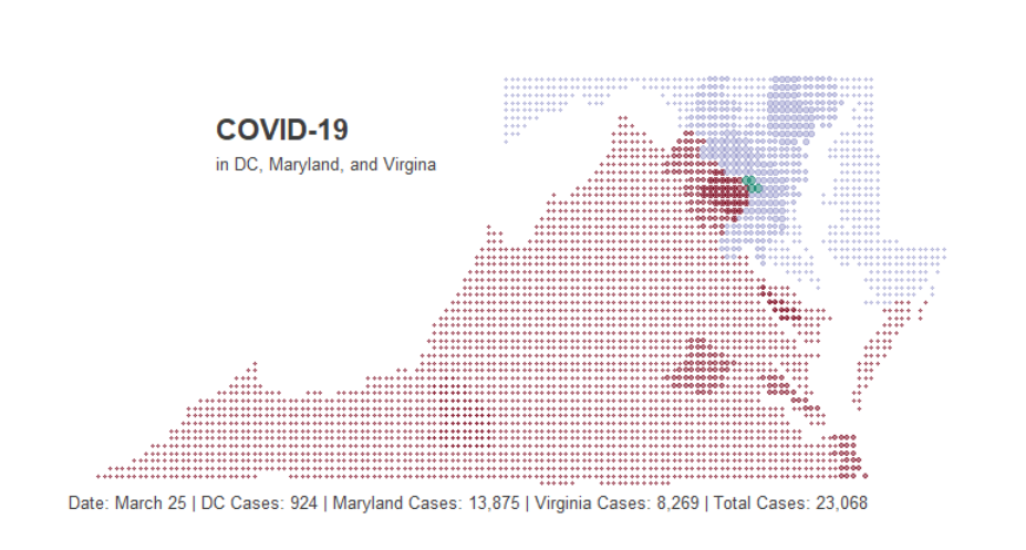
Learn to make a dotmap with the maps package and gganimate
Sentiment Calendar
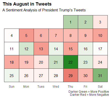
Create a sentiment calendar from twitter data using rtweet and ggplot2
Barchart Race
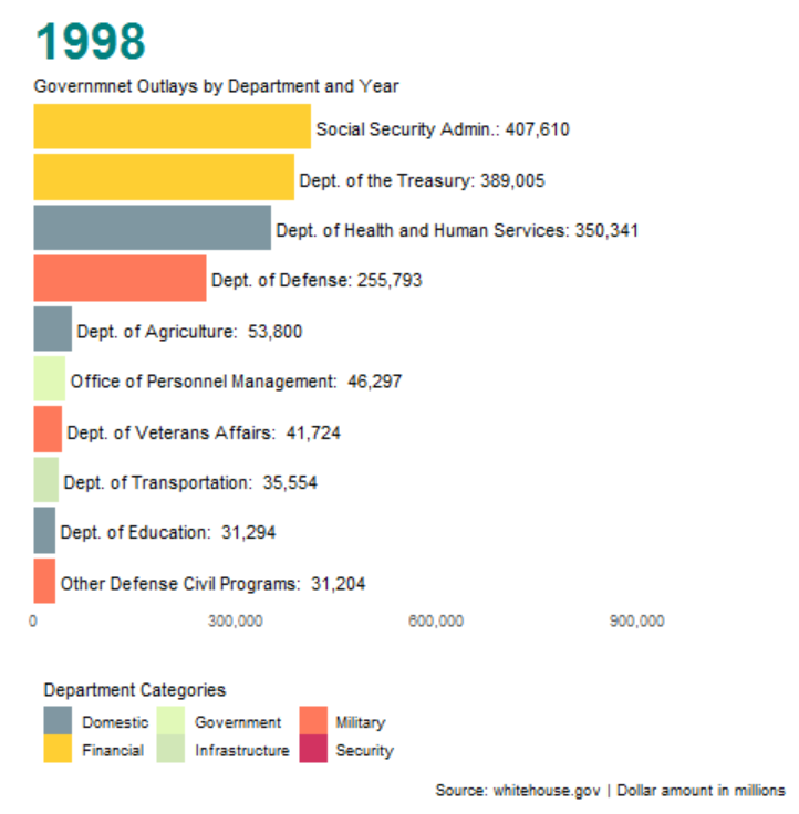
Learn to make a barchart race with ggplot2 and gganimate