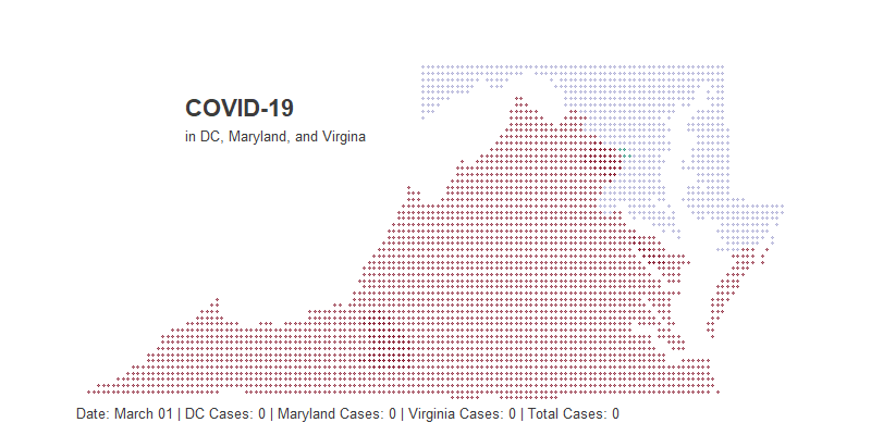
COVID-19 Dot Map
The unseen nature of the COVID-19 can make the virus feel even more threatening. Data visualization can be one tool that may lead to greater understanding and demystification of what is happening. In that vein, I created a dot map showing the change in the number of cases of COVID 19 in the DMV region.
Finding a Time Series
We will be using gganimate to stitch together a gif (which for the record is pronounced like the peanut butter) of the change in COVID-19 in the DMV region over time.
gganimate creates a gif by creating a sequence of plots and stitching them together, kind of like a flipbook. For more information on how this works, check out my post on making a barchart race or gganimate.com.
We will need daily COVID-19 by county to create a sequence. Luckily, we can find that data at usafacts.org, which a nonprofit organization founded by Steve Ballmer.
Unforuntately, the data comes with each day as a column rather than a row, so we will need to do some mild transformations. Additionally, we will be joining this dataset to a geospatial dataset later and thus need to standardize county names.
# Creating COVID Time Series ----------------------------------------------


# cleaning up data
dmv = read.csv("covid_confirmed_usafacts.csv", stringsAsFactors = F)%>%
  filter(State %in% c("VA", "DC", "MD"))%>%
  select(-c(ï..countyFIPS, stateFIPS))

# creating a time series
dmv_ts = dmv%>%
  mutate(county_state =  paste0(tolower(gsub(" County|\\.|'", "", County.Name)),", ",
                                tolower(
                                  ifelse(
                                    State == "DC", "district of columbia", #dc isnt in state.abb
                                    state.name[match(State, state.abb)]
                                  ) # ifelse
                                  )# to lower
                                ) # paste0
         )%>%
  select(-State, -County.Name)%>%
  gather(Date, Count, -county_state)%>%
  mutate(Date = mdy(gsub("X", "", Date)))%>%
  filter(Date >= '2020-03-01')
Because COVID first reached the region in early March, I filtered the dataset to only include dates past March 1st.
I want to point out that Maryland and Virginia both have some strangely named counties and cities, and thus need extra work.
# there are a few edge case county names that need to be adjusted for
dmv_ts = dmv_ts%>%
  mutate(county_state = ifelse(
    county_state %in% c("baltimore city, maryland",
                        "james city, virginia",
                        "charles city, virginia"),
    county_state,
    gsub(" city", "", county_state)
    ))

dmv_ts%>%
  slice(1:5)%>%
  kable()%>%
kable_styling("striped") | county_state | Date | Count |
|---|---|---|
| washington, district of columbia | 2020-03-01 | 0 |
| statewide unallocated, maryland | 2020-03-01 | 0 |
| allegany, maryland | 2020-03-01 | 0 |
| anne arundel, maryland | 2020-03-01 | 0 |
| baltimore, maryland | 2020-03-01 | 0 |
Creating a Dotmap
Now for the interesting part, creating a dot map. For more info on the method I am using, go here.
To make this map, we will create a square grid of dots over DMV and then remove the all the dots that don’t fall directly over DC, Maryland, or Virginia. First, lets create an evenly spaced grid of dots using lats and longs.
# DC, Maryland and Virginia sit between the 36th and 40th latitude
# and -85 and -74 longitude

lat <- data.frame(lat = seq(36, 40, by = .06))
long <- data.frame(long = seq(-85, -74, by = .06))

# create a lat long dataframe
dots = lat %>%
  merge(long, all = TRUE)

dots%>%
  slice(1:3)%>%
  kable()%>%
kable_styling("striped") | lat | long |
|---|---|
| 36.00 | -85 |
| 36.06 | -85 |
| 36.12 | -85 |
Next using the map.where() function from the maps package we are going to return the county from each pair of lat long. Then we can simply filter out all the dots that aren’t over the DMV.
Of course, map.where() returns some funkiness with county names that needs to be cleaned up as well.
# the map.where function returns the county given a lat long
dots = dots %>%
  mutate(county = map.where('county', long, lat))%>%
  separate(county, c("state", "county"), sep = ",")%>%
  mutate(county_state = paste0(county, ", ", state))%>%
  mutate(county_state = gsub(":chincoteague|:main", "",  county_state))%>%
  filter(state %in% c("district of columbia", "virginia", "maryland"))

dots%>%
  slice(1:3)%>%
  kable()%>%
kable_styling("striped") | lat | long | state | county | county_state |
|---|---|---|---|---|
| 36.6 | -83.56 | virginia | lee | lee, virginia |
| 36.6 | -83.50 | virginia | lee | lee, virginia |
| 36.6 | -83.44 | virginia | lee | lee, virginia |
Pulling the Final Set Together
As we mentioned before, gganimate is going to create many plots and then stitch them together into a gif. Basically, for each day we are going to create a dot map and then put them together like a flip book. So we will need to create a time series where every single day has all the data needed to create a map.
This will actually be quite simple. Just join the dots to the dmv_ts.
# Next we need to join the time series to our dot matrix
dots = dots%>%
  left_join(dmv_ts, by = "county_state")

dots%>%
  slice(1:3)%>%
  kable()%>%
kable_styling("striped") | lat | long | state | county | county_state | Date | Count |
|---|---|---|---|---|---|---|
| 36.6 | -83.56 | virginia | lee | lee, virginia | 2020-03-01 | 0 |
| 36.6 | -83.56 | virginia | lee | lee, virginia | 2020-03-02 | 0 |
| 36.6 | -83.56 | virginia | lee | lee, virginia | 2020-03-03 | 0 |
We are also going to want to create a total by day for each state in the region, as this information will be a caption in the final visualization. We will be using the glue package to return the daily totals.
# We want to create total for each region as a caption

dots_final = dmv_ts%>%
    separate(county_state, c("county", "state"), sep = ",")%>%
    group_by(state, Date)%>%
    summarise(total = sum(Count))%>%
    spread(state, total)%>%
    rename(dc = ` district of columbia`, va = ` virginia`, md = ` maryland`)%>%
    mutate(day_total = dc + va + md)%>%
    right_join(dots, by = "Date")

dots_final%>%
  slice(1:3)%>%
  kable()%>%
kable_styling("striped") | Date | dc | md | va | lat | long | state | county | county_state | Count | day_total |
|---|---|---|---|---|---|---|---|---|---|---|
| 2020-03-01 | 0 | 0 | 0 | 36.6 | -83.56 | virginia | lee | lee, virginia | 0 | 0 |
| 2020-03-02 | 0 | 0 | 0 | 36.6 | -83.56 | virginia | lee | lee, virginia | 0 | 0 |
| 2020-03-03 | 0 | 0 | 0 | 36.6 | -83.56 | virginia | lee | lee, virginia | 0 | 0 |
Making the Plot
Creating the actual plot is pretty easy.
Just create a scatter plot of the lats and longs. Because they are evenly spaced and only include dots over Virginia, Maryland and DC, this will create a grid of dots over those states. The size of the dots will be the number of cases, and the colors will be which state they are over.
When creating the ggplot portion of this visualization, don’t worry about the time series aspect of this. Everyday will just be plotted on top of eachother for now.
# Creating gganimate ------------------------------------------------------

dot_map = ggplot(data = dots_final) +
  geom_point(
    aes(x=long,
        y = lat,
        color = state,
        size = Count),
    alpha = .5
    ) +
  coord_map()+
  theme_void()+
  theme(
    plot.title=element_text(
                        face="bold", colour="#3C3C3C", size=22,
                        hjust = .2, vjust = -20
                        ),
    plot.subtitle=element_text(
                        colour="#3C3C3C", size=13,
                        hjust = .225, vjust = -28
                              ),
    plot.caption = element_text(
                        colour="#3C3C3C", size=13,
                        hjust = 0.1, vjust = 5
                              ),
    plot.margin = unit(c(0, 0, 0, 0), "cm"),
    legend.position = "none"
  )+
  scale_color_manual(values=c("#007a62", "#9999CC", "#7A0018"))

dot_map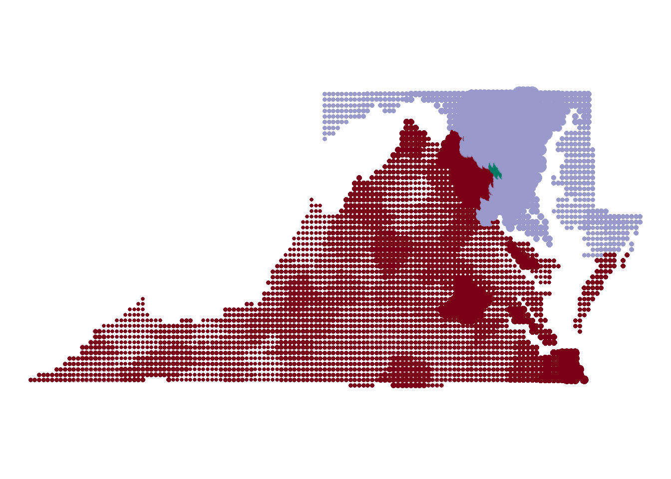
Next for the tricky part, we are going to add a label that show the daily cases by each region at the bottom of the map. glue allows us to interpret string literals, which is a fancy way of saying embedding r code into a string.
Looking below you can see a big chunk of unformatted code as the caption. We can’t really format it because return carriages will be displayed on the plot itself. Let’s look at what it would take to return the daily cases for just DC.
dot_map +
  labs(
   title = "COVID-19",
   subtitle = "in DC, Maryland, and Virgina",

   # Using glue we can find the relevant total

   caption = "Date: {format(as.Date(closest_state), '%B %d')} | DC Cases: {format(dots_final[dots_final$Date == closest_state,]$dc[1], big.mark = ',')} | Maryland Cases: {format(dots_final[dots_final$Date == closest_state,]$md[1], big.mark = ',')} | Virginia Cases: {format(dots_final[dots_final$Date == closest_state,]$va[1], big.mark = ',')} | Total Cases: {format(dots_final[dots_final$Date == closest_state,]$day_total[1], big.mark = ',')}"

   #caption = "{closest state}"
  )
Let’s look at what it would take to return the daily cases for just DC. What we are doing here is taking the dataframe that will be passed to ggplot and filtering down the date to closest_state and returning the first value for the district of columbia column.
So what is closest_state? This is a special variable that represents whatever variable you used to sequence your data. In our case, we are using the date to sequence the data, which is why we filter our date column down to the closest_state.
DC Cases: {format(dots_final[dots_final$Date == closest_state,]$dc[1], big.mark = ',')}Animating the Whole Thing
Finally, the actual animation part.
This is even simpler than creating the ggplot. Just specify which variable should be used to sequence the data (surprise its still “Date”), and specify a few things about how you want the gif to render.
If you are testing, I would recommend lowering the number of nframes. This will create less plots, which in turn will lower the rendering time.
dot_map+
  transition_states(
    Date,
    transition_length = 2,
    state_length = 1
  )


animate(dot_map,
        nframes = 150, #more frames for make it smoother but longer to render
        fps = 10, #how many frames are shown per second
        height = 400,
        width = 800,
        end_pause = 30
)
anim_save("covid19_dot_map.gif")
And there you have it! A beautiful gif showing the spread of COVID-19.